Monday, 28 January 2013

RESEARCH - Film Openings - Four Walls (Student Work)

Four Walls

SOUND
The non diagetic sound used was very disjointed and very chopped makes you feel uncomfortable. It had a slow pace.
Foley sound was used, for example, the scream and banging on the wall and when the character was cutting their fingers. This made me pay more attention to what was happening in the shot and showed it may have been important scenes. The scream made me think there was something wrong with the character, that she may be crazy or unstable.

EDITING
This opening is highly edited. There is use of a lot of transitions, for example,fade from black and the shot where her face was made blurry and went in and out of focus makes the character seem freaky and a bit mad. There were cross cuts to old papers with writing, a bracelet in her hand and photos. There was one part in fast motion contrasting with the sound which was at a slow pace.

MISE EN SCENE
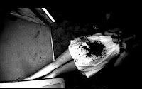
The lighting in this opening was very low-keyand the only two shots that were outside it was still dark. The costume was ripped and bloody and this made me think maybe something bad has happened or there's something wrong with the character. The space were it was filmed looked like a confined space or maybe it was portrayed as one. It made me think, why she's in that space? Is she trapped?
The facial expressions made me feel uncomfortable and uneasy as it was weird and she also showed emotions of anger and frustration which scared me a little. The makeup also set the character up as weird and unstable.
The characters body language when she was on the floor made her seem scared and timid as it was drawn towards her and not away from her.

CAMERA
There was heavy use of close-up's and medium close-you'd which have us an idea of who the main character in the film may be. It made me feel uncomfortable and weird. The camera tilted up and showed she had minimal clothing and this made me think again about the idea of her being trapped. Some high angle shots were used, maybe to show that this character might be a subordinate character.

Overall, the best thing about this opening is that the editing is really good and this sets the unease into the audience and also the choice of sound also creates an uneasy atmosphere. The mise en scene is quite in your face and makes you feel uncomfortable.

Sunday, 27 January 2013

Prelim Evaluation

The success full things overall was that we were able to produce the final products with all the shots we needed and following the brief. We included the shot reverse shot and the match cut and we did it in the type of a thriller (psychological).

Overall there are many things that we could have done better with this preliminary exercise. One is the narrative we chose to go with. We had to make a decision quite quickly so we could go on and take the shots for our storyboard and blog and be ready for the next lesson as we were behind. Our story was about a man who had previously taken some tests to see if he had a mental illness and he went to the doctor to find out the results. The brief said we had to shoot someone walking into a room, sitting down and having a conversation and the video had to include a match cut and shot reverse shot edits. The narrative we chose was quite broad and open to interpretation unless you know beforehand what is going on in the shots and I think if someone who didn't know the story they wouldn't easily figure out the scenario.
Also where we filmed was a problem. We used a media classroom which was quite disorganized and had bad lighting so we struggled to frame the shots properly and made it look like it was bad quality. In addtion
there were interference's with people walking and talking by so the quality of our shots would've been reduced as we had to rush them and try to get them over and done with before others walked by or in order to film when there wasn't speech in the background. Time is also an issue and hopefully with practice we will learn to manage our time properly

As well as other experiences of filming during lesson , this preliminary exercise helped us to get used to using the cameras even more and get better at editing and directing each other. This will help us when it comes to our own thriller opening as the shots will be better, thus, our final product will be better. Also, we'll be able to think more creatively in terms of narrative and make our thriller opening more interesting and appealing to our audience.

Photos of Alan editing the Prelim


These images shows our main editor (Alan) editing our prelim video. As it shows here, he is sorting out the match cuts and linking all the videos together,


Key Characteristics of Thrillers & Psychological Thrillers


To gain greater understanding of the Thriller genre and the general conventions of thriller films and Psychological Thrillers as that's our chosen genre for our film opening.

Thrillers
Thriller films usually involve:

  • A protagonist:c The character is usually curious, searching for greater good, faced with death at one point, on a quest and the film is usually from their point of view. The 'good guy' or the person we side with the most in the film.
  • Antagonist: The 'bad guy'. Must be stronger than the protagonist.
  • Protagonist and Antagonist  must come into conflict at one point
  • Mystery that must be solved
  • Desire for justice and the morality of individuals
  • A Thriller must promote intense excitement, suspense, high level of anticipation, uncertainty, anxiety, nerve wracking tension


Psychological Thriller
A psychological usually involves all those of a normal thriller plus:
Characters have to rely on their mind rather than their physical strength. The suspense created by psychological thrillers often comes from two or more characters preying upon one another's minds, either by playing deceptive games with the other or by merely trying to demolish the other's mental state.
  • Stream of Consciousness – Written equivalent of the character's thought processes. In psychological thrillers,through word usage, descriptions, or visuals we are invited into the characters mind.
  • First Person Narrative – In the opinion of the character and thus able to understand the mechanics of the characters' minds. 
  • Back Story – what has happened before hand. This deepens the psychological aspect of the story since the audience is able to more fully understand the character; more specifically, what the character's motivations are and how his/her past has shaped their current way of thinking.
Gaining a good understanding of these characteristics we allow us to be able to use some of these features in our film and narrative, for example for a first person narrative we could have a one of our characters doing a voice over, a stream of consciousness could also be done in this way.


Re-editing a film opening

We re-edited the film "Arlington Road". The scene of the film openings were split into different parts which we needed to put them back together in the order we wanted to which would look correct.

Firstly we decided to start off with the with the company idents, we were given two company indents and decided to place both in as it seems like both companies are working together to make this film. We then placed the title of the film as we thought it was most important for the audiences to know what the film is called so they know a little hint of what the movie is about.


After the title of the film, we decided to put who the music was by ,casting directors and editors. We didn't want to place in the Actors as we didn't think it was as important. But i believe we made a mistake. In future we should always put in the Actors so they could have more credit.


The font and colour of the text were all the same throughout the opening. This is because if we had different sizes and colour text, it would make it very confusing for the audiences to read. Also we made it one colour so it could be simple and clearer to read.

Planning - First Ideas

My idea is to create a psychological thriller. I have watched thriller before but I had never watched a psychological thriller and when looking into it to see what it was about, I became really interested in it and thought this would be great to do and I would have loads of ideas of what to create. Original and unique.

What I had in mind to do was to have two people involved. A boyfriend and a girlfriend. It's always girls being obsessed but in this one, it the other way round, the boy being obsessed with the girl. The couple would both go to the park and all things to seem romantic but then all of a sudden, the girl breaks off their relationship and  the boy acts as if he doesn't care but then when he gets home and into his bedroom, you will see a collage of his girlfriends pictures. There's a big one in the middle and little ones surrounding it. When he takes a red pen and circles the big main picture, something will happen to the girl.

This will be very hard to create as we will need a lot of pictures of the girlfriend and it will take a lot of time to make and it could be long, but I would love to do this and try and capture all these elements in a short time.

Student film opening analysis

The student film opening that I will be analysing is called the Paper Trail

Location
The location of this film opening is in a room which looks like it has been abandoned and also a place near a lake . The first half of the opening scene is inside this abandoned room and what this creates is tension because you now want to know what is going to happen inside of this room and then when you see the boy playing with the paper it then makes wonder what will happen next. The second half is near the lake where there is a boy who is dead is laying there while the killer walks away.

Sound
The music that has been used is very scary like and what this sound does is build tension as to what will happen next. There is a bit where the boy drops the paper swan on the floor. As it hits the floor, you hear a thud sound and this makes you scared but then anxious to know what will/has happened.

Editing
I really liked the editing because it moved swiftly when changing scenes and overall, everything moved smoothly. Very clean editing. They used a lot of fades which I think helped them get this clean editing but the fading had an effect which was it always kept you asking "what is going to happen now?"

Camera
There are a lot of close ups that have been used and this is to show the audience what exactly the boy is doing. for example, there are a lot of close up when he is dealing with the paper to make the paper swan. There are also a mid shot in the beginning to show us where we are which was the room and who was in it which was the boy.

Foley sound

Foley sound is a reproduction of everyday sound which is added to improved the quality of audio for films , games and radio.

We remade the film opening "Arlington Road" with missing sound so we had to add sound to the opening to make it more appealing. We started to record footsteps so it could match with the scene, we had to make sure that the footsteps synced with the one with the actual footage. After taking the sound of foot steps, we realized that it was not synced with the footage so we had to cut out parts of the footsteps to sync it together. In future , we have to watch the footage and record at the same time so we could make it sync together.

After recording the footsteps we wanted to record a breath so we has to start to breath next to the microphone. This was really synced well with the opening we made, we started to get the hang of Foley sound. We also decided to do this indoors as the weather did not turn up as we wanted it to be.

We then wanted to record the sound of a car engine which we could not as we had no access to it. So we skiped it and moved to the next sound we could make as we was running out of time. We started to try lip sync what the man was shouting. This was really tricky as we did not have an actual voice actor of the same person which did not match at all, but we tried our best to sync it together.

What we could do in the Future to improve-

  • Have no background sound (make it more silent)
  • Watch the footage while we are recording sound
  • Bring in more objects to go with the footage

Group Planning Ideas

Planning Ideas


My idea was to have a main character preferable female who struggles with body dismorphia, she claims to her friends that she is okay however deep down she has hidden secrets. There's inner demons in her body which possess her and makes her believe that  her aim in life is to be perfect. The psychopathic behavior comes when she attempts to get rid of those who shes believes are in her way of being perfect. She plans and kills in the most discrete way until it gets all out of hand.                                                                                                  
 
It will be quite challenging to try and portray that story line across with a 2 mins opening. I think the first few shots would be close ups of the characters face showing no emotion and in fact quite daunting, the lighting will be quite low to match the atmosphere. The camera slowly track her as she follows her everyday morning routine no sound or dialogue. Then it cuts into when the character arrives in college she is shot from a distance mainly showing abandonment, companionless. Colours are quite dull until the character's friends arrive and the whole atmosphere of dark, hidden and mysterious change to upbeat and things you see in everyday lives though camera focuses on main characters body language towards her female friends. The main prop will be a mirror this is the only way viewers will probably be able to understand the main character's issues .

PLANNING - My first ideas


Alan's Idea

As i had a convosation with my group, we decided that we wanted to go for a psychological thriller. I then watched the thrillers of the A2 Media students (Violet). I really like this thriller so i wanted to do something like it. I did not want the thriller to become to typical because it would be boring and the same. I wanted to do something more unique so that the audience would want to keep watching the thriller.

Opening
I came up with a boy sitting in a room all by himself doing a rubix cube, while he is doing the rubix cube there are flash backs of his life . He then does the rubix cube faster and faster and while he does it faster, more flash backs appear. While the boy does the rubix cube, we see somebody coming into the scene and as soon as he finishes, a women comes in and the boy looks at her, she ends up dead with the boy looking down at her instantly.

Props and clothing
  • The boy is wearing ragged and old clothes with blood on it.
  • Rubix cube on the table
  • Only a chair and table in the room with pictures of children drawing
  • Woman is wearing normal clothing (teenager)
  • there is 1 window in the room and outside is a garden


Holiday Homework - Research 2

During the holidays i watched the movie "Unknown" which was released in 2011. In this film opening, there are many elements (Sound, Editing, Mise en scene and Camera). This opening is kind of a classic opening where we start with a view that is outside a window then zooms out to see a man in a plane. By doing this, it makes the audience confused and drawn into the movie.

Location

This movie starts up in a plane going to birlin, we can see this by when they are at the airport the women says   "welcome to birlin". By going to Birlin, it makes the audience wonder why they are there and immediently think that they are going there for an holiday. This gives us a hint if what the movie is about.

Sound
Throughout the whole opening, we can hear a really calm sound which is building up really slowly. By having a sound building up , it gives the audience more tension which makes us wonder even more what the movie is about. Also when they are inside the taxi, we can hear a arabic language which also makes the audience think of terrorism and what could happen next.

Editing
i really like the editing in this opening as it when they change scene is mostly match cuts. I also like the titles that are edited with fade. This matches with the sound to make it feel more calm. By having this , it seems like they are having a normal holiday out.

Camera
In the opening there are mostly medium shot so we could see what they are wearing and their facial expression. As soon as when the man realize that his suitcase is missing, it makes it seem like he is vulnerable by having a long shot. When there is a over the shoulder shot when the women is talking to the cashier it seems like she has taken half the screen and he has taken a quarter which makes the women much more superior than him. But when there is a reverse shot, she has become smaller which means she has lost the power over him after he said the room is not available.


RESEARCH - Previous student film opening

I decided to watch the film opening "Violet". This film opening was made from A2 students who took media studies.

Location
I believe that the location of this film is really good as the woods are really mysterious and quiet. By having this location, it gives the audience a hint of what the story is about. In most wood scenes, people usually get lost which gives the audience a hint of something that is in the forest. This gave me and my group a hint of where we should do our locations and we would like a similar location.

Editing
In my opinion i loved the editing in this opening. It gave me a little fright as it was really dark and quick. By having quick shots, it gave me a shock.I think that by having fades in the opening, it made the opening very mysterious and intense. By doing this it made it much  more thrilling. The editing also changes the colour of the video black and white. This makes the video look old like the Victorian times which makes it more frighting.

Sound
Throughout the opening, there is a spooky sound , heart beats and wind. It is really simple and is repetetive, this is so we could concentrate on the images more than the sound itself. Also by doing this, it makes the audience have an adrenaline rush to what they are going to see.

Camera
Mostly there were long shots of the girl in the woods. This is used so that we could see her whole body so the audience called see the blood on her clothing and see what she is wearing. There are also medium shots so we could see closer to her face. At the end of the opening there is a close up on her face so we could see her facial expression. This makes the audience's frightened because there is blood on her face and she looks really scary.

Prelim: Filming of the prelim


These are pictures of us filming our prelim. Our prelim is in the style of a psychological thriller and the scenario is between a doctor and a patient and the patient is being given bad news which he cannot come to terms with.


While recording the prelim, there were things that went well, that didn't go well and things we could be improved. The good things were that we got majority of the footage needed for the editing for the prelim. Also, everyone was given a role and we accomplished our roles to our best ability. Attilla did all the filming, Alan and Joyce were the actor/actress and Dionne took the behind the scene shots and directed the different scenes. Dionne made sure that all scenes were done and Attilla made sure that she filmed eah shots more than once, so we get it right. Alan and Joyce were good in their roles and only went of task a few times, for example when they got their lines wrong.


The bad things about recording this prelim was the timing. We didn't have enough time to do more recording because we wanted our prelim to be a bit longer then it turned out. We had limited time. Another thing is that some of the shots didn't come out as we wanted, as we had trouble with positioning the camera and it is visible in our final product.


The main thing we need to improve on is timing. We always need to take into account the amount of time we have to film and learn how to manage our time efficiently so our time goes to good use and as a result our shots we be better quality and have more material to edit. Another thing that we should improve on is making sure that the camera is position properly while filming and we should always double check the shots by watching them back  straight after filming so we make sure they're correct and if not we'd be able to re-do the shot at the time of filming instead of noticing while editing as we won't be able do the shot again.


Holiday Homework - Research 2

I watched an American thriller called "Sacrifice" which was released in 2011. This film falls into other categories such as action and drama but it still contains some thriller elements.

Here are some of the conventions I noticed in this film:

  • It has the traditional opening title sequence 
  • It contains a lot of edits such as flashbacks, jump cuts and  cross cuts.
  • Most scenes are dark which build tension

Holiday Homework - Research 1

 Panic Room
"Panic Room" is a simple discrete opening. We know this because the opening scene does not give any insight as to what this film will be about. All it shows is buildings around New York with the title sequence in the middle. This makes the title sequence the main focus through out the opening sequence. The filming of the buildings are during the day being bright makes it harder for the audience to know what type of thriller it could be but it lets us know where all the film will be taking place and it is all in New York.

The music used sounds very tensed and this creates tension and also what this sound does let the audience know that this film will be filled with tension. The shots of the building all differ. There are long shots, medium shots, wide shots and close ups.

Underworld:Awakening

This film opening is very different to the previous one because this film opening tells you exactly what the film will be about. The opening is very dark and very action packed which we can see with all the weapons that are being used such as guns and knives which tell the audience that this is a dark film and it is very action packed all the way through. The background music also supports the darkness of the film. The editing that were used in this film opening were jump cuts, fast motion and editing fro perspective. The movement of the opening scene was fast and it was from one persons point of view of what was going on and there was a lot of jump cuts from one scene to the next.

Screenshots for prelim

This photo is us filming our prelim video. As we edited our prelim video, we realized this shot did not follow the rule of the third rules which made it really hard to put in.We then had to place this shot into the video as we had no time left to film and blended it into the next scene. Our goal next time is to take more footage of the same scene and overlook what we have done wrong.


In this screen shot, it shows us editing the titles. we originally wanted to place the title at the center of the screen as it did not go really well with the other positions. But one of our member of the group (Dionne) suggested we should put it at the bottom right of the screen as it looked more clear and fits better. We all then agreed.


This scene was really hard as we had to do a shot by shot. By overcoming this problem. One of out members of the group ( Alan) decided to watch both clips at the same time so it would look more synced. We also wanted to place an point of view shot (Pov) shot into the prelim video which made it look more unique.


This is the timeline of the our video closen up so we could gather all the details.

Film Opening

The film opening that I have looked at and really is from the film called "The Expendables". Here is the film opening.


The reason why I like this film opening is because as you see the title sequence of who is in the film and the producers of the film, you start to see the opening of the actual film and you also see all the stars of the film. 

This film follows the traditional way of the title sequence. The order of this film sequence is:
  • IDENT
  • Production company's
  • Distribution companies
  • Well known actors
  • The movie title
  • More actors
  • Casting Company
  • Music composer 
  • Editor
  • Costume designer 
  • Production designer 
  • D.O.P
  • Co-producers
  • Executive producers
  • Producers
  • Story makers
  • Screenplay
  • Director

Holiday Homework Reasearch 1


The Matrix

The type of opening "The matrix" has is a discrete opening, we can see this by confusing the audiences with all the codes and numbers. The colouring of the opening is very dark and mysterious. By doing this , this gives the audiences a clue of what the movie is about. Also by having dark colours, this helps the audiences know that the movie would be very sneaky. Towards the end of the opening, we see soldiers armed with guns which also tells us that there would be a lot of action in this movie and also shows us one of the main characters in the film.

The sound of the opening seems really mysterious and calm at the start of the opening but as it goes further into the opening we hear lots of aggression when the armed people barge the door. The editing in the opening is really amazing as it seems like there is a code and we are actually heading inside the code as it zooms in to show another scene. The camera shots starts with a long shot which then zooms into an extreme close up of a police officers face by doing this we can see his facial expression. The movement that the camera uses is a tracking movement which looks like we are spying on the police officers.The scene seems like they are in a hotel as there is a door number "303" at the door. As they go into the door, we see a character which has a low angle, this makes her much superior than the police officers as it looks like she has more power.


Murder By Death (1976)


In a similar way this opening is also a discrete opening. In this opening , we have no idea what this is about as it only shows cardboard with characters in it. But it might show us a hint of the characters. The editing looks really mysterious as we can see their eyes moving even though its just cardboard. This makes it look really creepy towards the audiences.The scene seems like, it based in a mansion as we can see the background of all the cardboard that there is a mansion. In this opening, we do not meet any of the main characters which makes the audiences wonder even more.

Saturday, 26 January 2013

Extension Exercise ‘Watching’ Documentary


1). When Thomas Sutcliffe says "films need to seduce their audience into long term commitment he is referring to thriller openings, stating that the first part of the film is crucial for interesting the audience by the opening being a success it is likely that the audience will be intrigued and want to continue watching the film.

2). According to Jean Jacques Beineix, he says the risks of instant arousal is what happens next in the film. The risk is that the questions that the audience ask may not be answered. By having such a strong start it is questionable whether the whole film will deliver with the same standard. He recommends that an instant arousal is not the best way to catch an audience’s attention

3). The beginning of the movie must show the narrative and characters without revealing information. It is important that too much information is not given away so that the audience are drawn into the film. After an opening of a thriller, the audience should still feel quite uncertain due to the opening being clever and vague; they must feel this way and still want to know more.


4). Stanley Kauffmann describes a classic opening as an establishing shot e.g. New York , a close up of a particular building, then a shot of a window and then the camera would go past the receptionist desk into a private office, showing the character.  He praises this type of opening because he says it is a good way of revealing basics of the film e.g. where is it? What’s the main character occupation? All questions are answered without the opening being so complex.

5). Kyle Cooper's title sequence to Seven is effective because the title sequence includes shots relating to the thriller, the title sequence introduced the main character without revealing information, thus becoming the first scene of the movie.

6). Orson Welles wanted his film's opening to be a scene without credits and title music as he wanted the audience to be immediately drawn into the story, Universal Studios removed the effect that Orson Welles wanted by adding the titles to the opening sequence.

7). A favorite trick of ’Film Noir' is when the opening of a film is actually the end of it; this means that the audience will want to watch the film so that they find out the reverse story line of it. The beginning of the film is its ending as it reveals what will happens at the end.

8). The opening of The Shining creates suspense because the car is being track by the camera from a distance which will make audiences assume that the car is being followed, the audience are made to feel as if the people in the car may be travelling to somewhere that they shouldn't be creating suspense though this is what keeps the audience on edge and wanting to watch the film.

Friday, 25 January 2013

Analysing Previous Student Film Openings


                 I chose Violet as my first student example of film opening. I felt this style opening had ideas quite like my group.
         
       Throughout the opening there are a variety of foley sounds being played its noticeable that some sounds are looped as they're heard throughout the whole video and others are only place at specific times. Its possibly that not all sounds were theirs though the different types worked well together. Their foley sounds are really effective because they were able to create them in a way of which it sounds sophisticated and very authentic. By the use of editing they were able to make the sounds in sync with what was happening in the clip making the opening seem very realistic. Right at the end there's a small bit  of dialogue from the female character this effect allows views to engage with the opening it leaves us viewers feeling intrigued, wanting to know more.
        
       The filming locations varied some shots were in a house some in outside woodland places and some in outside open spaces. The chosen locations worked well with the theme. If the location had been different then most probably it wouldn't have the same effect on viewers. When places like the woods are filmed they're often associated with abandonment, companionless and separation hardly any positive thoughts come therefore that location was a good decision. The shots in the house are really manipulated with lighting.                                                                                           The lighting sometimes changes to black and white, which makes the whole atmosphere seem slightly terrifying, shots are also filmed in way looking like the camera is not steady this adds to the realistic approach. Without the manipulating the effects would be much more different.
       
   The female is petite,she wears a small white dress which symbolizes the innocence and angelic, the stain of blood on the dress contrasts with the ideal symbolism and this makes audience captivated by the idea and put more into he characters prospective connecting more with the film. Photos are used as props they're are in black and white therefore quite vague to viewers giving hardly any clues to what is going to happen next.
  
     The camera shots differ. There's a lot of tracking and long shots with the female character in it. Audience see the female's whole body as she is shot from a distance mainly in the scenes in the woods. This contributes to the feelings  abandonment, companionless and separation viewers feel previously stated. Camera tracks her as she is dragged around areas of the home and up the stairs. 
        
   A lot of editing is done in this clips some obvious aspects and some less obvious than others. The layered effect of shots works really well with this theme as it perhaps suggests a story line quite precarious story line ahead. 


Wednesday, 23 January 2013

Structures of Film Openings

There are 3 main structures to title sequences; A Narrative opening (with titles running throughout), a discrete title sequence and titles over a blank screen (followed by. An added forth type of opening is stylized editing.


TITLES OVER A BLANK SCREEN (followed by the narrative opening)
This is just titles on a a screen and then the film starts. 

STYLIZED EDITING
This type of editing is amazingly stylized and includes heavy effects, which means, there's a lot of editing


The other two types of film opening structures I used examples to show how it would look.

NARRATIVE OPENING - PANIC ROOM


In this type of opening the characters are introduced and the setting as you see footage of this and the titles appear over the footage. The film usually opens in the first minute. The example I used for this type of opening is Panic Room which is a psychological thriller and it follows the conventions of this type of opening. The tiles appear over some infamous structures and places in New York, this establishes the setting.

DISCRETE TITLE SEQUENCE - SE7EN


Discrete title sequences are separately edited sequences that stand apart from the film opening. They are stylised and heavily edited, and they support nearly all of the opening credits and film title. In this title sequence, there isn't any insight into what the film is about, but you see the titles and you get a feeling of the film from it.  


Monday, 21 January 2013

Structure of film openings

There are 3 main structures to a film opening which is used for most film openings. In these films, it gives the audiences a hint of what the film is about and an introduction of the film. The 3 main types of film openings are discrete,Narrative and stylised editing. These 3 types of film openings are all good in their own way.

Discrete opening -  An example of an discrete opening is the movie "six feet under", the opening does not have much information about the film and has credits rolling at the top of the film. This helps the audience wonder what the movie is about.


Narrative opening - An example of an narrative opening is the movie "The shining" as it gives us alot of information about the film. It gives us the Location of the film at the start which makes the audiences straight away know where the film is based in. It also makes the audience understand that there is a family going on a trip as it is a family car.


Intertextuality

Intertextuality are when films borrows ideas from each other. The audiences would recognise these by the camera angles, Mise en scene, editing and sound from both films.

An example of this is from the famous shower scene from "Psycho". In this clip, many films have borrowed ideas from this scene.


In the clip "The stepfather" They have borrowed the idea from psycho when there is a man in the bathroom with her trying to kill her. Also when the man falls down the exact same shot from psycho is shot compared to psycho's. The Mise-en-scene, Camera shot and Editing are very similar between the two clips.


By doing this, in our thriller , we could use ideas from other thrillers to put into our own thriller film

Thursday, 17 January 2013

Preliminary Match Cut Exercise

Planning and Preparation
We had to make up a story quickly so we chose to do a doctor scene with a patient coming in for a diagnosis. Initially no props were needed. Joyce and Attilla were playing the roles of Doctor and Patient and Dionne directed and took the shots.

The Storyboard


This is a storyboard of what we are going to film. In this scene Attilla is a patient and Joyce is the doctor and she came to get results for tests she had done previously. The doctor then tells her that she has a mental illness and she doesn't take it lightly. If we had more time we would've done more shots, like Atilla's reaction to her diagnosis and of her sitting down. Some of the shots could have been improved by adding angles to some of the shots to show dominance and sub-ordinance and better framing of the shots so the type of shot is clearer.

Structures of Film Openings

When making a film, the structure to the opening is very important. There are different types of film opening. The 3 main film opening structures are: discrete opening, narrative opening and stylised editing. All the opening structures differ and it depends on what mood you want to create. Some are basic and some of them are complicated as it uses a lot of editing. Here are some examples of theses openings.

The Sin City opening is a simple stylised editing as it uses a lot of cartoons pictures and writing. The effect of this type of opening is that it stands out with all the editing.
This opening however doesn't give off any clues as to what the film will be about. 

The Se7en opening is an example of a discrete opening as the opening does not tell that much about what the film will be about but it does give clues s to what could happen so the audience can try and figure it out. What happens in a discrete opening is that it will have a lot of writing on a black background and then little snippets of something happening then it will go back to the black background with the white writing. 


Wednesday, 16 January 2013

Film Audience Research

In thrillers suspense, tension and excitement are the main elements. Some thrillers contain gruesome scenes and strong language. The main target audience with thrillers because of what it contains starts from the ages of 12 and upwards and the people who will watch theses are people who like the gruesome scenes and like the tension and excitement.

 Memento is a thriller which is targeted to people aged 15 and upwards. This is rated 15 because there is strong language and it contains violent scenes that people younger than this age can not watch. With the strong language and the violence scenes, theses will entertain the aged group that they are targeting. 


 Limitless is a mystery thriller which is targeted at people aged 15 and upwards. This is rated 15 also because like the last one, there is a lot of strong languages, violent scenes and it contains sexual senses. Theses things are age appropriate and by having theses things in the movie, it makes it more interesting. 


Tron is a action sci-fi thriller which is rated as PG (parental guidance). This film is rated a PG because the film is alright for children but there are some scenes that parents would not like their child to see. For example some of the violence that is there may not be suitable for a child.  


Intertextuality

What is intertextuality?
Intertextuality is a term to describe visual references between films. This is when films borrow from each other and the audience recognise certain parts of a film whether it be the mise en scence or the sound that is being played or even just the editing that is being used.

An example of this is the film Psycho. Here is an example of how intextuality has been used with a scene from Psycho.


Tuesday, 15 January 2013

Intertexuality

Intertextuality is a term to describe the visual referencing between films. Quite literally, films 'borrow' from each other and aspects of certain camera angles, aspects of mise en scene, snippets of sound and editing methods the may be recognizable in some films that has been seen in others.

I will use the example of the synonymous shower scene from Psycho one of the most widely recognized thrillers and this scene has been used in countless amount of movies.

Below is the clip from Psycho and also, Fatal Attraction and What Lies beneath, who have used this scene in their movies also.


In this clip, we see a woman going into the bathroom for a shower, most of the things in the bathroom are white, for example, the batth and the tiles. Whilst she was in the shower you see a shadow of the killer through the translucent shower curtains. The curtains then get pulled back and the woman get stabbed multiple times, whilst struggling to fight off her attacker. We see cutaway shots of the blood dripping down and flowing with the water and then we see a shot of her hand on the white tiles, sliding slowly and then he body sliding down also. Then she grips onto the shower curtain pulling it off as she falls and (we see a close up), then the blood flowing in the bath with the water into the drain. Then a close up of her eye, the camera moves out to show her face then the shower head.

FATAL ATTRACTION


There are many similarities between this shower scene and Psycho one. Some include - the all white bathroom, women are wearing white and also the male. The multiple stabbing of one character, struggling to fight off the attacker. Although they changed it a little as the woman being attacked husband comes along and fights of the killer and drowns her, and there we see the close up of her face in the water supposedly dead (like in Psycho) until she pops back up and gets shot but the woman she tried to kill. Then there's her sliding down the white tiled bathroom war which was also in the Psycho scene

WHAT LIES BENEATH


This scene is a little bit different to the one in psycho but still includes some of its features. There's the same white bathroom and the running shower. The man is trying to kill her but instead of stabbing her to death and he has drugged her so she cannot move, and she'll eventually drown. Another similarity between this scene and Psycho is the close up of the characters face after they've been killed, although she isn't dead, even though she looks dead.


Using the features/elements from other thrillers in our thriller opening will help it to be recognizable as a thriller and it also show our understanding of a thriller and elements that make up a thriller.

Audience Research

Most of the thrillers contain very strong languages and are mostly violent which makes it more suitable for the ages 15 and over, by doing this, it makes the target audience for thrillers for adults/Teenagers as they are more mature and understand more than children.


Inception Poster

The movie Inception is a thriller which is targeted to the audience that are aged 12A. This is targeted towards young teenagers. These types of thrillers contains mild languages and less violence as the audience's are the age of 12. People that are under the age of 12 needs to be accompanied by an adult if they are watching it in the cinemas or buying and the adult must decide if it is appropriate for the children to watch the movie or not.


Black Swan Poster                                         


This movie is a  mysterious thriller and it is targeted with audiences that are aged 15 or over. This movie is mostly targeted towards teenagers as it is violent and has strong language. By having strong language and violence into the movie, it attracts the teenagers to watch the film as most teenagers find it much more interesting and natural.


Jaws Poster


Another type of thriller is are thrillers that are targeted with the audience that are PG. This allows younger people to watch thrillers as well. By having the audience rating as "PG". This makes the movie much less violent and has no strong language within the film at all. Also since this is targeted to young people, they make the scenes much less horrific so they would not scare them as much.

Sunday, 13 January 2013

Timeline Research

Actor names are shown before the actual film title 


The film title appears first in the sequence meaning that all character are average as opposed to the previous timeline were there were characters names shown before the title.

The title sequence in a movie hardly changes. There will only be change if the actors starring in the movie are very popular therefore their names will appear before the film title.

The order of the title sequence is
- IDENT
- Production Companies
- Distribution Companies
- Well known actors
- Movie title
- More actors
- Music composer
- Casting company
- Costume designers
- Film editor
- Production designers
- D.O.P
- Executive producers
- Other names added depending on movie genre
- Director

The amount of screen time each name has changes depending on importance e.g the higher paid character's name would be there more than an average character.
Its very import getting the title sequence correct because if the format was to change and perhaps the title appears at the end, it would make the whole film seem more like a trailer therefore its important to keep that in mind when adding names to our 2 minute thriller opening.


Coming To America

This opening is not for a thriller though it does follow the title sequence. So the genre doesn't have different order of title sequence. At the beginning of the opening the IDENT is shown, though the films own soundtrack is played instead of the IDENTs sound track.  The text doesn't vary in any shape or form, the font and colour is slightly different than ones usually used for film though this way it fits in with the movie theme. When watching the  film opening higher paid actor Eddie Murphy's name appears first before the actually movie title, when his name appear its noticeable that it is displayed on a slightly darker background showing his significance. The name stays on screen for 6 secs, 2 secs more than the other actor names to come.


Secret Window

Coming to America and Secret Window both have opening sequences where a highly popular actor's name is shown before the actual film title. Johnny Depp's name is on screen for 5 secs. This is a thriller opening therefore the font is very clear and simple. The size vary titles are smaller than actual names. The jump between each actor is 3 sec and not all actors are displayed alone. Positioning of the names hardly differ though actors with less popularity last short on screen 3 secs.


Wednesday, 9 January 2013

Film Audiences


The film industry is interested in looking at the tastes and opinions of actual audiences through studies, such as surveys, focus groups, and interviews because the film industry is a money making enterprise, it remains successful only by producing films that make a profit over and above their (increasingly sizable) budget and marketing costs. The industry needs to bring in as many viewers as possible and therefore must keep close tabs on what types of stories will appeal to the greatest number of viewers at any given moment. The industry cannot afford to bank on hypothetical concepts of the film viewer but must seek out real audiences, both through research and through marketing in order to ensure that financial investments pay off. However, audiences shift over time in accordance with cultural tastes and trends - consumer tastes are always changing.


Thrillers
Statistics show that the most popular age bracket for thrillers is 16-24 which would be appropriate as they usually involve complicated plots which may not be understandable or appealing to a younger audience as they'll find it harder to work out what is going on and issues being addressed in the film they may not have had much experience in so it'll seem alien to them. This also why I think that the age rating for majority of thrillers is 15 or above.
The thriller genre has many sub-genres and this can dictate their target audience for example 'Black Swan' would attract more women because its dance aspect but the Bourne movies will be more appealing to men as most action thrillers are. To be able to enjoy a thriller you have to be intrigued the mystery and enjoy suspense and the element of surprise and enjoy trying to figure out the plot along with the characters.

The Silence of The Lambs


As further research I will look at the film The Silence of the Lambs and the audiences they targeted and attracted also how audiences responded to the film. This film was rated 18, so by this you can tell the audience they wanted to attract was an older one as it may have a complex storyline or issues that wouldn't be appropriate for younger viewers. This film received great critical especially, Jodie Fostor and Anthony Hopkins performance in the film and also it was one of the highest grossing films of 1991. The fact that it was one of the highest grossing films shows that people liked the film otherwise they wouldn't have paid to go and see it, although there are other factors when it comes to how much a movie makes this is also an important one.